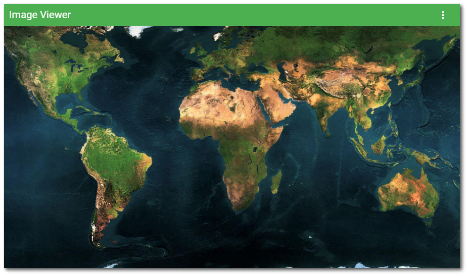
The Image Viewer Widget displays a variety of image file types: PNG (Portable Network Graphic), JPG/JPEG (Joint Photographics Experts Group), GIF (Graphics Interchange Format), and SVG (Scalable Vector Graphic). This widget reduces setup time compared to displaying images in the HTML widget. Images will resize to fit the width of the widget (regardless of file resolution) and the widget height will scale to keep the aspect ratio. A vertical scrollbar is enabled on the widget when the height of the image file exceeds the height of the widget. When the widget is added to a dashboard, a translated message is displayed informing the user to select an image file to view in the Widget Editor. See Widget Editor section below for instructions on how populate the Image Viewer widget.

Note: The Image Viewer Widget appears blank if no image has been selected or if the user does not have permission to view the selected file. |
Widget Editor
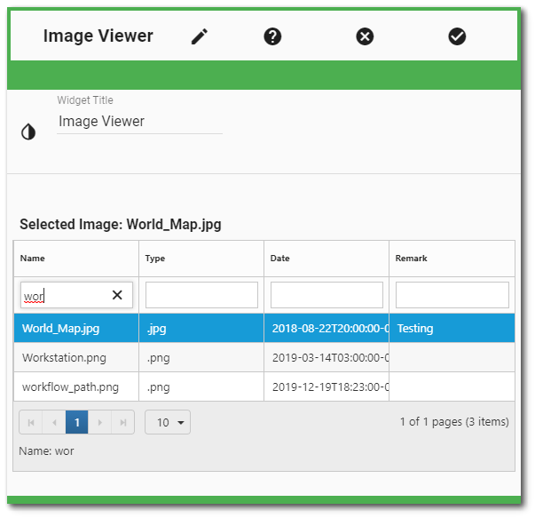
To choose the image file to be viewed in the widget, open the Widget Editor by selecting the More Options ![]() icon in the upper right corner of the widget to display the drop-down menu and then select the Edit menu option. The Widget Editor displays a grid containing all image files in the DT_FILE table and the title of the currently selected image file (if one is selected). The grid consists of the following columns:
icon in the upper right corner of the widget to display the drop-down menu and then select the Edit menu option. The Widget Editor displays a grid containing all image files in the DT_FILE table and the title of the currently selected image file (if one is selected). The grid consists of the following columns:
Title |
Name |
Date |
Remark |
|---|---|---|---|
The title of the image file given when the file is uploaded. |
The name of the actual image file uploaded. |
The date the file was uploaded in ISO format (YYYY-MM-DD). |
The remark given when the file was uploaded. |
The bottom of the grid contains paging controls for displaying a limited number of files at a time, as described below.
Arrows – Use the left/right arrows to navigate through pages.
Go to Page List – Select a specific page to navigate directly to that page.
Rows per Page – Change the number of files to be displayed per page by using the drop-down menu.
Count of Pages and Total Items – This control indicates the total number of files available in the widget, how many pages to display the files, and which page is currently selected.
To facilitate finding the desired image file, the grid columns of the Widget Editor can be sorted or filtered.
Sorting – The columns are sortable by clicking on the column header (click again to reverse the sort).
Filtering – To filter the file attributes (e.g., title), enter a search term in the appropriate search box beneath the column header. Only attributes that contain the search term will be displayed.
Select an image file from the grid to view in the widget. Selecting an image will highlight the row and assign the title of the image file as the Selected Image file.

To deselect the image file, click on the file again in the grid. Saving the Widget Editor with a selected image file will display the image file when the widget loads.
Widget Properties
Widget Title – By default, the widget title is Image Viewer. The title can be modified.
Widget Color – The color of the widget can be changed using the Widget Theme![]() icon to the left of the widget title.
icon to the left of the widget title.
Widget Object Editor – To set various appearance properties of the widget, select the Object Editor ![]() icon in the widget header to open the Widget Object Editor. See the Widget Editor article for more details.
icon in the widget header to open the Widget Object Editor. See the Widget Editor article for more details.
Help – The Help ![]() icon connects to the online documentation related to the specific widget.
icon connects to the online documentation related to the specific widget.
Copy Settings – Select the Copy Settings ![]() icon to to copy the settings from another widget of the same type. See the Copy Widget Settings article for more information.
icon to to copy the settings from another widget of the same type. See the Copy Widget Settings article for more information.
Cancel – Select the Close without Saving ![]() icon to exit the Widget Editor without saving changes.
icon to exit the Widget Editor without saving changes.
Save – Changes will be applied to the widget by clicking on the Save ![]() icon. The Widget Editor screen will close after the save operation is complete.
icon. The Widget Editor screen will close after the save operation is complete.